Meet Selenian
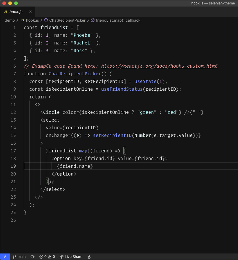
Selenian is a dark theme for Visual Studio Code (referred to as VS Code from here on out) that draws inspiration from earth's lunar companion, the moon. I'll go a bit more in-depth on why I chose this as a "base" for my theme later, but my goal was to create a minimal dark theme that uses thoughtfully placed color to make reading and scanning code easier.

Why "Selenian"?
Honestly, because "Moon" seemed a little boring and "Lunar" theme names were already taken 😅. I've always found outer space to be interesting and the fact that space is both dark and quiet seemed to lend itself to the tone that I wanted my theme to take on. Since I was going for a minimal theme, I thought the moon was an appropriate "base" due to its rather dull and monotone color. With that being said, let's take a closer look at some of the decisions I made with regards to specific token colorizations within code.
Choosing the Color Scheme
One thing that is really nice about creating my own theme is that it's mine and I'm free to make decisions that I like, as opposed to accepting decisions another theme has made for me. If other people find my theme enjoyable, that's great, but ultimately I created this theme as something I want to use day in, day out.
The first thing you'll notice about Selenian is that it's not very colorful and that's by design. A lot of themes that I have tried in the past look great, but they have different colors being used for so many different tokens in the code that my editor ends up looking like a fireworks display. With Selenian I was going for something much more minimal, which is why I made use of multiple shades of grey to make up a majority of the token colorizations. There are a couple of exceptions though.
Methods
While creating this theme I knew that I wanted to inject some color that would help scan code quickly. When there are too many colors in a theme I think scanning becomes more difficult. One aspect of code that most languages have some concept of is methods or functions. Personally, I think the invocation of a method is something that you want to see while scanning because there is a potential for state change or functionality to be viewed. For this reason, I chose a blue-ish/purple-ish (#8989ff) tone for code that is tokenized as a method. I thought the color fit well with the theme overall and was easy to scan.

Constants/Literals
Another aspect of token colorization that I want to call out is the use of constants and literals. I feel that constants and literals are also pieces of code that are important for scanning code. Whether it be looking for a particular string literal or a constant numerical value, those tokens felt meaningful enough to merit some color. So I decided to go with a light purple (#ffa7ff) for code that is tokenized as a "constant" or "number", while string literals are denoted with a light blue (#a7ffff). I felt both colors worked well with the color used for methods, but also provided enough difference to scan easily.

Comments
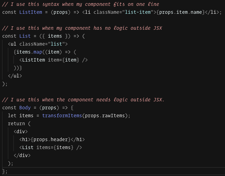
The final piece of this theme that we'll cover is comments. In my opinion, comments should be used to provide context for other developers that may not be obvious by reading the code. I think we should all strive to write readable and maintainable code, but let's be honest, stuff gets complicated for a multitude of reasons, and the best way to help out your teammates or future self is to write a comment providing some additional information. With that being said I think comments should be highlighted and not hidden away based on color. Once again this comes back to scanning code. If there is an important comment in the code that I'm scanning, I want to be aware of it. I chose a light-red (#ff9d9d) for comments to make sure they stood out and are easy to read. I also set comments to use the italic style of the font to provide a little more differentiation from the code.

Wrapping Up
Writing a theme for a text editor isn't everyone's cup of tea and this theme that I created probably won't be everyone's cup of tea either. In the end I think a lot of it comes down to personal preference and accessibility. I set out to create a minimal dark theme that I enjoy coding in and I think I achieved it. I definitely encourage you to give Selenian a spin and give it a rating based on your experience. You can see the code on GitHub if you're interested in that as well!